
Let’s Make a Book! Part Two: Design
There are many small decisions to make when designing a book. No matter how inconsequential it may seem, each one will impact a reader’s experience. When you self publish, you’re not only a photographer, you’re also an editor and a publisher, and you have to consider the potential impact your decisions will have on the story you’re telling whether you’re editing, sequencing, or choosing materials and construction techniques. You’ll find yourself wondering, for example, how a reader will feel opening a hand-stitched book as opposed to a book with stapled pages. When you think of your own experiences with the books on your shelf, you’ll realize how much the little things matter.
I had never designed a book before we published our first title. I’m not a professional designer, just a book lover with a working knowledge of InDesign, which I’d used in my work as a marketer, but never for my own photography projects. For that first book, I began by gathering sources of inspiration. This continues to be the first step in my process. I often find inspiration in books, found objects, and artwork. When we started on Fireworks, I was responding to four major influences: vintage yearbooks, family photo albums, vintage fireworks packaging, and Lara Shipley’s Desire Lines.
Vintage yearbooks
We’re lucky to have a collection of our grandfather’s yearbooks from his time at Alexandria High School and the University of Alabama. I used these not only as inspiration, but also as sources for images that would help tell our story, which centers on our grandfather’s decision to leave college to go to work with his father as a sign painter (a decision that had a lot to do with a girl). We used images of our grandfather playing in a marching band as well as images of his classmates, who helped define this pivotal time in his life. The yearbooks provided a natural starting point, but they also created a mood and a style we were able to play into as we gathered other sources. Since their pages frequently featured collages, I began to design in that mode as well.
Family photo albums
One thing I’ve always loved about our family photo albums is the paper that was used for backing. Worn with time, its color is no longer a true black, if it ever was. Several of the images in Fireworks are scanned from these albums. We even scanned a blank page to use as our own backing after finding out that using a color treatment or new black paper did not communicate age in the way we wanted to.
Vintage fireworks packaging
Sometimes, an early source of inspiration is helpful in that it points you in a direction, even if you don’t end up making use of it in the way you imagined. Early on in the project, I worked with vintage fireworks packaging and advertising, hoping to make use of its graphics and design. But every time I borrowed directly from these sources, something felt off. It was only when we decided to ship our zine in a slipcover featuring a screenprint of a firework that the idea of packaging found its eventual, albeit subtle, home.
Lara Shipley’s Desire Lines
One of my favorite book designers is Tiffany Jones of Overlapse Press. She’s not afraid to use different media, fitting things together like puzzle pieces in a way that transports her readers to another world. In 2023, Overlapse published Desire Lines by Lara Shipley. The book’s layered treatment of text and image influenced the way I approached the spreads in Fireworks.
Iterations
Once I’d gathered my sources, I realized I was in danger of drowning our story in material and had to begin the process of parsing the elements that helped communicate it from those that distracted from it. This process resulted in multiple designs as we sorted out what worked and what didn’t. Sometimes, you can’t know this until you hold a book in your hands and try to view it as a reader. We made three drafts of Fireworks before we arrived at a design that accomplished what we’d hoped to.
Design one: Maxing it out
For our first dummy, I went all in on the collage concept. I included graphics from fireworks advertisements like bucking broncos and pop-art-esq explosions. Playing off the idea of boyhood, I added crayon embellishments to images, drawing circles around yearbook photos of the classmates our grandfather remembered into his old age, circling his face in crowds. Every source of inspiration found its way in. Needless to say, it was too much. But in order to realize this, I had to have a sense of how the elements would fit together on paper and not just on a computer screen. So, I cut a Moleskine notebook down to size, printed the images and text we wanted to use, and glued or taped each element in. This gave me a sense of scale and placement and allowed me to use my hands to manipulate the layers. Once I had the first sketch of the layout, it was time to return to the digital file, updating it to reflect the many decisions I only could have arrived at on paper.
Design two: Dialing it back
After another round of digital proofing, I printed the project again, only this time, rather than printing its separate parts, I printed it as a single document. At this point, although we were still dialing back on collage and considering paper size, the sequencing was nearly complete. This meant that it was time to start discussing materials.
As we tested different papers, we realized the crayon embellishments did not hold up well on any of them. We tried other methods but were never satisfied with the results, so the embellishments were abandoned even though we were quite happy with them in the previous draft. We also realized the use of taped-in photos did not have the same impact on this project as it had on Dark Water Lavender, so it was abandoned as well.
This version included the most updated copy, which gave Leah a chance to proof and edit the text. She’s always able to see more and read closer on paper than she can on a computer screen, so having a draft she could hold in her hands led to a more thorough edit and creative shaping of the text.
Design three: Only the essentials
Our third draft was our most pared down version. It was made at home on an inkjet printer, just like the final version. With this draft, we were able to see what needed to be done in terms of final touches. Slight changes were made to the collage layouts, color profiles, and sequencing. Although small, these changes made a big difference and helped us land on the right pace and number of elements.
Although we were nearing our final draft, we were still experimenting with paper options for our interior pages and cover, as well as different methods for binding. Initially, we liked a simple, stapled version, but we ended up choosing a looser binding option, which we’ll discuss further in our next post.
Up next: Materials and construction
In part three of “Let’s Make a Book!”, we’ll walk you through the choices we made about materials and what impact they had on the overall design and messaging of our zine. Sometimes, when you’re self publishing, you have to work with what you have. This might sound like a limitation, but we’ve discovered that so-called limitations can spur your creativity in unexpected ways if you hang in there, keep experimenting, and keep your sights on the vision that started it all.
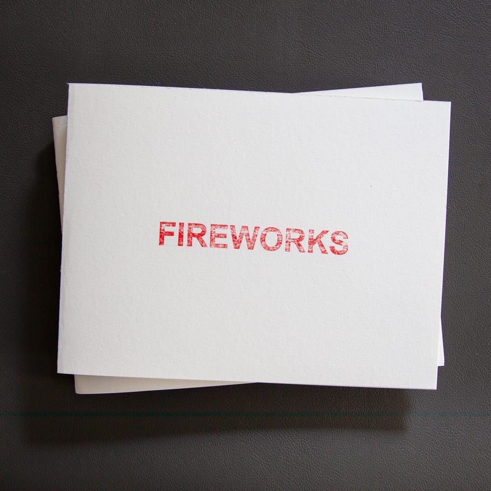
Fireworks is now available in limited quantities. Please visit our Memory Vistas bookstore to learn more.
I’m looking forward to reading all of your works! You’re doing a wonderful job with all the raw materials you’ve had to work with. Way to go, brother! Way to go, sister!🩷🩵🩷